About Shadcn UI Todo App Blocks
A todo app lets people capture tasks, mark them done and see what is left, and in team products it adds owners, priorities and due dates. These six shadcn todo blocks go from a personal checklist to a sortable task board, two client project trackers, a sprint table and a detailed task drawer.
Like the rest of our shadcn blocks, they are built with React, TypeScript and Tailwind CSS on top of shadcn ui components such as Checkbox, Table, Tabs, Drawer, Dropdown Menu, Calendar and Collapsible. Every interaction runs on local state, so you can add, check, filter, reorder and delete tasks right away, then connect the same shadcn components to your own API.
Key Elements of a Todo App
- Quick add: an input or a plus button that creates a task in one step, without leaving the list.
- Completion control: a checkbox that marks a task as done and visibly strikes it through.
- Task metadata: priority, status, due date and assignees shown as badges, dates and avatar stacks.
- Grouping and filters: status tabs or collapsible groups, search and filter menus to narrow long lists.
- Task details: a drawer with subtasks, attachments, comments or a progress timeline for work that needs context.
- Bulk actions: row selection with move, complete and delete for cleaning up many tasks at once.
Where and Why to Use Todo App Blocks
Task screens look simple but collect a lot of logic: optimistic updates, empty states, filters that combine, validation and undo. Starting from a working block saves that work and gives you a tested layout for both small and large lists. Because these are regular shadcn components styled with Tailwind CSS, they match the rest of your shadcn ui dashboard.
- Personal productivity apps: a clean checklist for daily tasks and habits.
- Team task managers: assigned tasks with priorities, due dates, subtasks and comments.
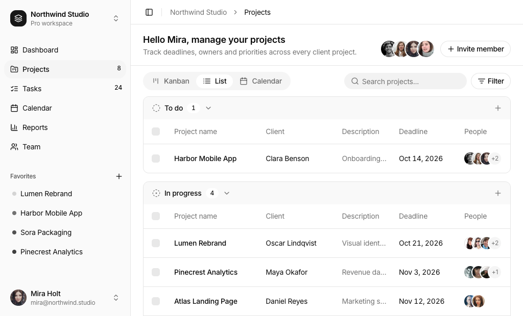
- Agency and client work: track projects per client with deadlines and the people involved.
- Sprint planning: group tickets by status or priority and adjust them inline during planning.
- CRM and admin panels: add a task list for follow ups next to customer records.
- Onboarding flows: give new users a checklist of setup steps they can tick off.
Todo App Blocks in This Collection
- Todo App 1: The starting point for a personal list, a getting started checklist or a small widget on a dashboard, with no extra packages to install.
- Todo App 2: Pick it for a full task manager where people reorder their own work, switch between list and grid, and open each task to manage subtasks, files and comments.
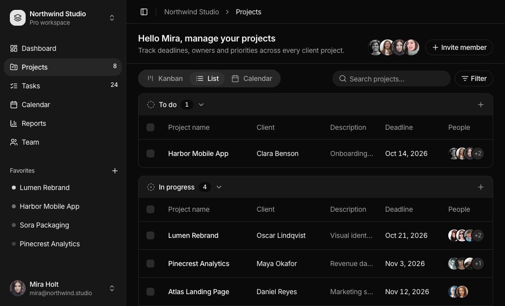
- Todo App 3: Suited to agencies and studios that need a projects page inside a complete app shell with sidebar navigation and favorite projects.
- Todo App 4: The same project tracker without its own sidebar, for when you already have navigation and only need the page content.
- Todo App 5: A dense table for product teams running sprints, where tickets have codes and you change priority or due date without opening a form.
- Todo App 6: Use it as the detail view behind any task list when a task moves through review and delivery stages and teammates log progress notes.
Similar Block Categories
- Kanban Board: show the same tasks as columns and drag them between stages.
- Gantt Chart: plan tasks on a timeline when start and end dates matter.
- Event Calendar: place due dates and deadlines on a month or week view.
- Tables: more data table patterns for sorting, pagination and row actions.
- Empty State: guide users when a list or filter returns no tasks.
Accessibility
In Todo App 1 every checkbox is linked to its task text with a Label, so clicking the text toggles it, and the add and delete icon buttons have screen reader text. Todo App 2 gives each card a button role, makes it focusable and opens it with Enter, gives the checkbox a label that changes between “Mark as completed” and “Mark as pending”, marks the star with aria-pressed and supports keyboard reordering through the drag handle. Its form fields use labels, aria-invalid and visible error messages. The tables in Todo App 3, 4 and 5 label every row checkbox and select all checkbox, and Todo App 6 marks the current status step with aria-current.
The project and sprint search fields in Todo App 3, 4 and 5 rely on a placeholder, so consider adding an aria-label. You may also want the task cards in Todo App 2 to open with the Space key, like native buttons.
Todo App FAQ
npx shadcn@latest add @shadcnuikit/todo-app1 after adding the Shadcn UI Kit registry to your components.json.@dnd-kit/core and @dnd-kit/sortable. In list view the movement is locked to the vertical axis with @dnd-kit/modifiers, and a keyboard sensor lets you reorder cards without a mouse. Install the four dnd-kit packages, including @dnd-kit/utilities, before you add the block.Todo type in types.ts with title, description, assignees, status, priority, created, due and reminder dates, subtasks, comments, attachments and a starred flag. Todo App 3 and Todo App 4 use a Project type with client, deadline, people, priority and status. Todo App 5 uses a Task type with a code such as PS-204, a subtask count, a list name and a due date. Replace the sample arrays in data.ts with your API response.date-fns, Todo App 2 to 6 show toasts with sonner, and Todo App 2 also needs the dnd-kit packages for drag and drop. The drawers are built on the shadcn Drawer component.