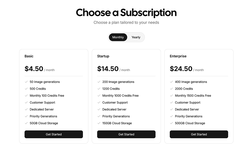
About Pricing Table Blocks
Pricing table blocks are shadcn blocks that display multiple plans or tiers in a structured, comparable layout. They are built with React, TypeScript, shadcn/ui Card and Button components, and Tailwind CSS. Each block typically includes plan names, feature lists, price display, and a primary CTA per tier. Optional “most popular” or “recommended” styling helps highlight a default choice. The markup and layout are ready to use so you can focus on copy and pricing logic.
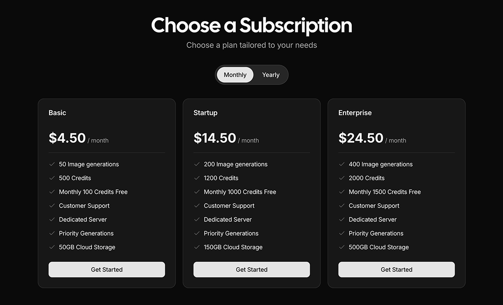
They are intended for SaaS pricing pages, subscription products, comparison pages, and any site that needs to present two or more options side by side. Use them on dedicated pricing routes in Next.js, in marketing or product sections, or inside modals and onboarding flows. The same blocks work in light and dark themes and integrate with the shadcn registry and CLI for quick install or copy-paste.
You can fully customize plan names, features, prices, and CTA labels. Layout and styling are controlled via Tailwind and component props—add or remove tiers, change grid columns on different breakpoints, or restyle cards and buttons. Because the code is in your project, you can wire buttons to checkout, signup, or analytics without being limited by a fixed API. The underlying structure stays consistent with shadcn UI and your design system.