About Shadcn Onboarding Screens Blocks
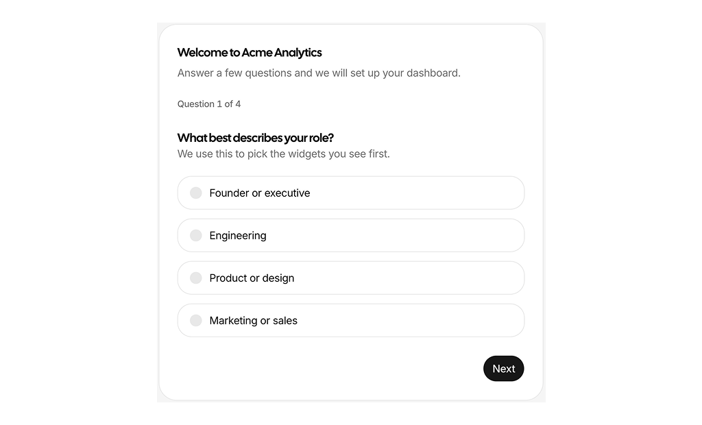
Onboarding screen blocks are shadcn blocks that cover the first minutes a user spends inside your product: a guided questionnaire, a multi step wizard, a profile completion checklist, and a summary screen that closes the flow. Built with React and TypeScript, they use shadcn/ui questionnaire, card, progress, input, select, and slider components styled with Tailwind CSS, so you start from a working flow instead of wiring one from scratch.
They suit SaaS signup flows, workspace creation, team invitations, and account setup inside admin panels. Use them in Next.js or React right after authentication: collect the role, team size, and goals that shape the default dashboard, connect a data source, invite teammates, and show the user exactly which steps are still open. Every screen tracks its own state, so progress indicators, disabled actions, and completion badges stay in sync with the answers.
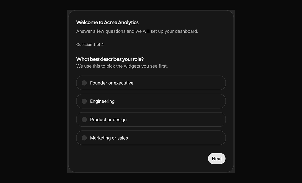
Questions, choices, step order, and validation rules live in your code. Steps can be required, skippable, or hidden based on an earlier answer, and keyboard shortcuts let people move through a flow without touching the mouse. Tailwind controls spacing, card layout, and responsive breakpoints, so you can add a step, change a field, or restyle the progress indicator while keeping the same shadcn UI structure and light and dark theme support.