About Shadcn Store Navigation Blocks
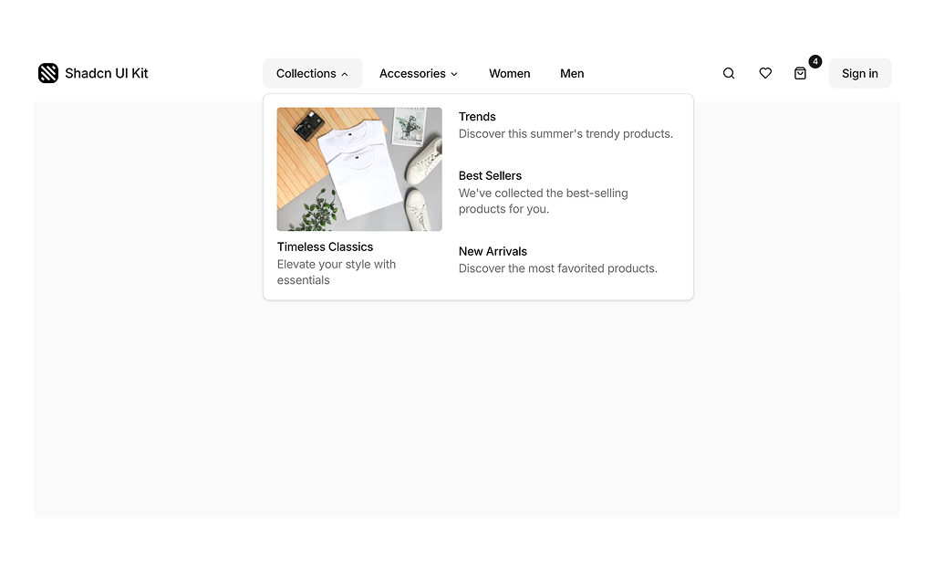
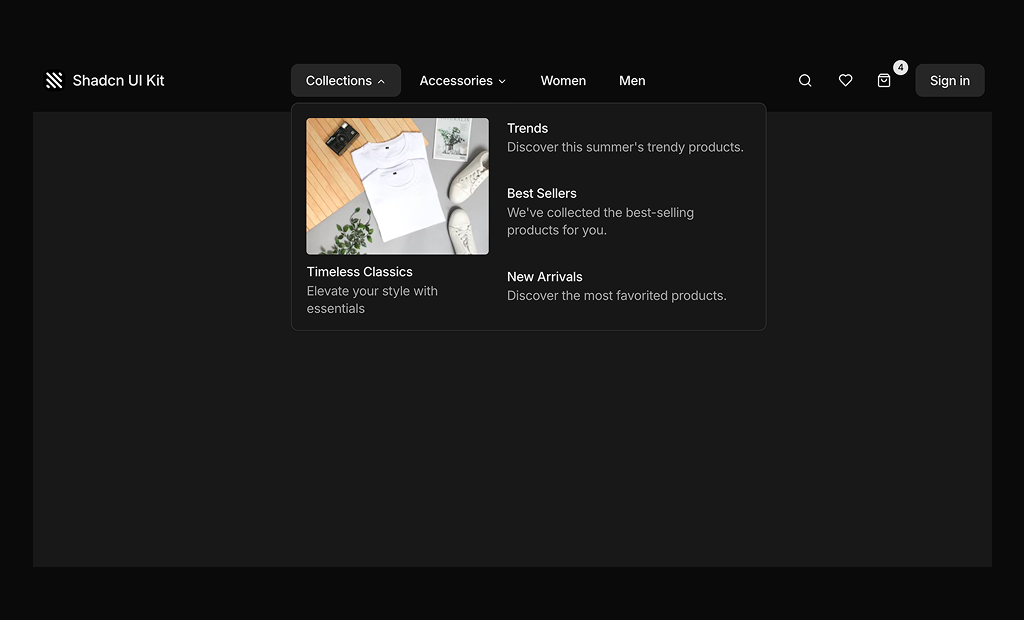
Store navigation is the header that shoppers use on every page of an online shop to jump between categories, search the catalog and reach their wishlist, cart and account. This shadcn store navigation block combines rich category dropdowns with image and icon links, quick action buttons and a full mobile menu.
Like the rest of our shadcn blocks, it is written in React and TypeScript, styled with Tailwind CSS and built from shadcn ui components such as NavigationMenu, Sheet, Button, Badge and Separator. The categories live in two arrays and the accessory icons in a separate icons file, so you can map your own catalog onto the shadcn components without rewriting the layout.
Key Elements of a Store Navigation
- Logo: links back to the homepage from every page.
- Category menus: dropdowns that group sub categories with short descriptions, images or icons.
- Featured collection: an image card inside the menu that promotes one collection.
- Quick actions: search, wishlist and a cart icon with an item count.
- Account access: a Sign in button that later becomes the account menu.
- Mobile menu: a panel that keeps every category reachable on small screens.
Where and Why to Use Store Navigation Blocks
Navigation is the one part of a store that every visitor uses, often several times per visit. Rich dropdowns let you show the depth of the catalog and promote a collection without sending shoppers through extra landing pages. Because the header is assembled from shadcn ui components and Tailwind CSS classes, it stays consistent with the product, cart and checkout blocks you add below it.
- Fashion stores: collections and accessories menus with Men and Women as direct links, as in the sample content.
- Multi category shops: icon grids that make long lists of sub categories easy to scan.
- Campaign periods: swap the featured image card in the menu to promote the current collection.
- Mobile first stores: the side sheet repeats every category with larger tap targets.
- Headless commerce frontends: drop in a ready header and connect the links to your commerce platform routes.
Store Navigation Blocks in This Collection
- Store Navigation 1: A good starting point for fashion and lifestyle stores that want to promote a collection inside the menu while keeping accessories and gender categories one click away on desktop and mobile.
Similar Block Categories
- Navbars: simpler headers for marketing sites and SaaS landing pages.
- Shopping Cart: the cart page or drawer that the cart icon opens.
- Product Category: the category pages that the menu links lead to.
- Footers: repeat the main categories and policy links at the bottom of the page.
Accessibility
The desktop menu is built on the shadcn NavigationMenu, so the Collections and Accessories triggers open with the keyboard, links can be reached with Tab, and Escape closes an open dropdown. The cart button has an aria-label of “Cart” and hides its icon from screen readers, and the mobile menu opens in a Sheet that traps focus while it is open.
The search, wishlist and menu buttons show only an icon, so consider adding an aria-label to each of them. The cart count in the Badge could be included in the cart label, such as “Cart, 4 items”. The logo and menu images use placeholder alt text that you should replace, and adding a visually hidden SheetTitle to the mobile menu gives it an accessible name.