About Review Cards Examples
Review cards are focused components that highlight customer feedback, ratings, and social proof in a compact format that fits naturally into product pages and landing sections. They typically surface a star rating, short quote, reviewer identity, and sometimes a product or plan label, all within a layout that draws attention without overwhelming surrounding content. When implemented using shadcn ui primitives and enhanced with tailwindcss utilities, ReviewCards align visually with other shadcn blocks like pricing tables and feature grids inside a next.js application.
On the technical side, a ReviewCards component is usually a typed react wrapper that receives structured review data: score, title, body, author, and optional metadata such as usage duration or company. Strong TypeScript interfaces prevent incomplete or malformed reviews from reaching the UI, which is especially important when ingesting data from external platforms or APIs. Shadcn ui components such as cards, badges, and icon buttons provide the building blocks for layout and interaction, while tailwindcss supports quick experimentation with emphasis, spacing, and responsive arrangements across multiple cards.
For SEO and content strategy, ReviewCards play a key role in reinforcing relevance and trust around target keywords without resorting to keyword stuffing. In a next.js site, they can be rendered server‑side on critical commercial pages so that search engines see the underlying review text and structure. Because ReviewCards are shared react and typescript components, you can reuse them across homepages, comparison pages, and in‑product upsell flows while maintaining a single source of truth for both styling and semantics.
Which Review Card Example Should You Pick?
The thirteen examples fall into four groups. Start from where the reviews will appear on your site.
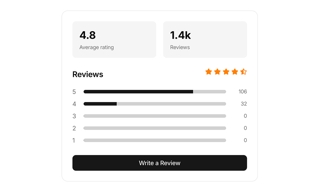
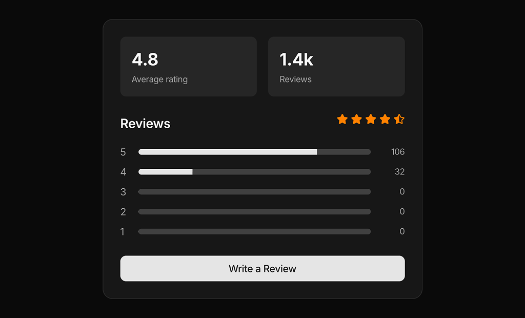
- Rating summaries: Review Card 1 and Review Card 3 show how ratings are spread across one to five stars with progress bars. Place them above a list of reviews on a product page.
- Testimonials: Review Card 2, Review Card 8, Review Card 9 and Review Card 10 present a quote with a name and role. Review Card 9 adds a large photo and a headline, and Review Card 10 uses a speech bubble with the avatar on its top edge.
- Customer reviews: Review Card 4 is a simple review from a verified customer. Review Card 5, Review Card 7 and Review Card 11 add votes, replies or photos. Review Card 11 also shows a reply under the review.
- Detailed and business reviews: Review Card 6 shows the reviewer's total spend and review count with comment and message buttons. Review Card 12 breaks the review into attributes, pros and cons. Review Card 13 is a B2B review with a Google Review badge and a 5.0 score.
Review Card FAQ
npx shadcn@latest add @shadcnuikit/review-card4 after adding the Shadcn UI Kit registry to your components.json. Change the number at the end for the other cards.