Shadcn Integrations Sections

Seamlessly connect with popular AI and productivity platforms using ready-to-integrate shadcn/ui components. These integration sections feature polished layouts, recognizable logos, and clear calls-to-action, making it easy to showcase, link, and leverage third-party tools for your users.

Integrations 1 Pro

Centered headline above a three column grid of integration cards, each with an app logo, name, one line description and a Learn More link button.

Integrations 2 Pro

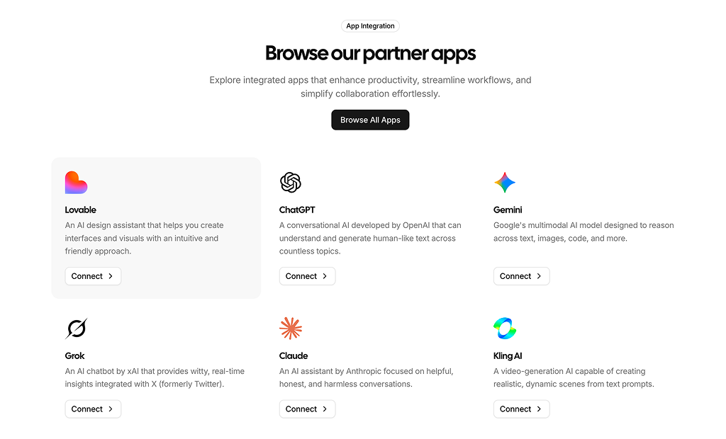
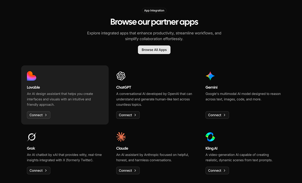
Header with an App Integration badge, headline and Browse All Apps button, above a three column grid of app cards with logo, name, description and a Connect button.

Integrations 3 Pro

Compact centered section with a headline, a row of overlapping round app logos that show each app name in a tooltip, and a See all integration button.

Integrations 4 Pro

Two column layout with a headline, short text and Explore Integration button on the left and a grid of logo cards with app names on the right.

Integrations 5 Pro

Two column layout with copy and a Browse All Apps button on the left and two columns of logo cards scrolling vertically in opposite directions on the right.

Integrations 6 Pro

Headline and Browse All Apps button above two rows of logo cards that scroll horizontally in opposite directions with faded edges.

Integrations 7 Pro

Centered integrations heading with a badge and link on a dotted background, surrounded by brand logos that slowly orbit along a large ring.

About Shadcn Integrations Blocks

An integrations section shows the tools and platforms your product connects with, so visitors can see at a glance that it fits their existing workflow. These six shadcn integration blocks cover the common layouts: descriptive app cards, a compact logo row, a logo grid next to your copy and two animated marquees.

Like the rest of our shadcn blocks, every layout is built with React, TypeScript and Tailwind CSS on top of shadcn ui components such as Card, Badge, Button and Tooltip. The sample content uses popular AI tools with real SVG logos, which you replace with your own apps. All blocks are responsive and follow your light and dark theme.

Key Elements of an Integrations Section

  • Benefit headline: one line such as “Integrate with your favourite apps” that tells visitors why the logos matter.
  • Recognizable logos: the best known tools first, because visitors scan for the apps they already use.
  • App names: a visible label or a tooltip for every logo, so the section is readable and accessible.
  • Short descriptions: one line per app when the integration is not obvious from the name.
  • A path to the full list: a Browse All Apps, See all or Explore Integration button that leads to your directory or docs.

Where and Why to Use Integrations Blocks

People rarely buy a tool that does not fit the stack they already use. An integrations block answers that question on the page, before a visitor has to search your docs or ask sales. It also works as social proof: well known logos next to your product signal that it is established and easy to adopt. Because these are regular shadcn components styled with Tailwind CSS, the section matches the rest of your shadcn ui pages without extra design work.

  • SaaS homepages: place it after the main features to show that the product plugs into the tools teams use every day.
  • Pricing pages: a short logo row near the plans removes a common doubt right before the purchase.
  • App marketplaces: cards with a Connect button turn the section into a small directory where users can start a setup.
  • Developer platforms and APIs: show the frameworks, SDKs and services your API works with.
  • AI products: list the models and AI tools your product connects to, as the sample content does.
  • Agency and portfolio sites: present the tech stack or the platforms you build on for clients.

Integrations Blocks in This Collection

  • Integrations 1: A card grid for products whose integrations need a few words of explanation. Each card can link to its own setup or docs page.
  • Integrations 2: Works like a small app marketplace, with a Connect button on every card and a Browse All Apps action at the top.
  • Integrations 3: The most compact option. Overlapping round logos fit under a hero or between two larger sections, and tooltips keep every app named.
  • Integrations 4: Puts your message first, with the explanation on one side and the supported apps on the other.
  • Integrations 5: A vertical marquee beside your copy. The moving columns suggest a large ecosystem without a long static list.
  • Integrations 6: A full width horizontal marquee that works as a closing band on a homepage or landing page.

Similar Block Categories

  • Feature Sections: explain what the product does before you show what it connects to.
  • Testimonials: add customer quotes as a second layer of social proof next to the logos.
  • Stats: back up the integration story with numbers such as active users or connected apps.
  • How It Works: walk visitors through connecting an app in a few steps.
  • Call to Action: close the section with a clear next step, such as starting a free trial.

Accessibility

Keep a visible name or an accessible label for every logo. Integrations 3 already gives each round logo button an aria-label with the app name and shows the same name in a tooltip. For the animated blocks, consider pausing or disabling the motion for visitors who set their system to reduce motion, and make sure the important apps are also named in nearby text.

Integrations FAQ

An integrations section shows the third party tools, platforms or APIs a product connects with, usually as logos or cards. It answers a common buying question before the visitor has to ask it: does this product work with the tools my team already uses?

They are ready-made integrations sections built with shadcn ui components and Tailwind CSS. Instead of designing a logo grid or app directory yourself, you add one of the six blocks to your project and replace the sample apps with your own.

Compatibility is one of the first things buyers check. Showing the tools you connect with answers that question early, reduces support and sales questions, and works as social proof because visitors recognize the logos.

A headline that states the benefit, the logos of the best known tools first, the app name for every logo and a link to the full list. When an integration is not self explanatory, add a one line description and a button to connect or learn more.

On SaaS homepages after the main features, on product and pricing pages where compatibility affects the decision, and on developer or partner pages. A compact logo row also fits between two larger sections.

Integrations 1 and Integrations 2. Both show a card per app with a logo, name and a one line description. Integrations 1 ends each card with a Learn More link, Integrations 2 with a Connect button and adds a Browse All Apps button in the header.

Integrations 3. It is a short centered section with a headline and a single row of overlapping round logos. Each logo shows the app name in a tooltip, so the row stays compact without losing the names.

Yes. Integrations 5 scrolls two columns of logo cards vertically in opposite directions next to the copy, and Integrations 6 scrolls two rows of logo cards horizontally with faded edges. Both loop continuously, so they work well when you have more apps than fit on screen.

Each block keeps its apps in a plain array or in a list of cards at the top of the file, with a name, an SVG logo component and, in Integrations 1 and 2, a description. Replace the sample AI tools with your own apps, swap the SVG logos and point the buttons to your docs or connect flow.

Integrations 5 animates its two logo columns with the motion package. Integrations 6 uses the InfiniteSlider component, which is built on motion and react-use-measure. Make sure these packages are installed in your project before you add either block.

Yes, in Integrations 6. Its rows use the InfiniteSlider component, which accepts a speedOnHover prop next to the default speed of 40. Set a lower value and the logos slow down while the pointer is over them, so visitors can read the app names.

Edit the grid classes. Integrations 1 and Integrations 2 use one column on phones, two from the small breakpoint and three on large screens. Integrations 4 starts with two columns and switches to three on medium screens. Change the grid-cols values to fit the number of apps you show.

Yes. In Integrations 1 every card takes a link prop that feeds its Learn More button, so you can point each app to its setup guide. In Integrations 2 the Connect button on each card can open your OAuth flow or an install page.
Yes. The sample logos are inline SVG components, so you can swap each one for the official SVG of the app you support. Check each brand's logo guidelines, keep the logos at a similar visual size and only show apps you actually integrate with.

No. All six integrations blocks are part of All Access, the one-time license that also unlocks every other block, admin dashboard and template with lifetime updates.

All six are responsive. Integrations 1 and Integrations 2 drop to a single column of cards on phones, Integrations 3 keeps its compact row of round logos, and Integrations 6 scrolls the same way on small screens as on desktop.
shadcn integrations sections
Unlock Premium Blocks & Sections
Premium blocks are part of All Access. One license unlocks the whole Shadcn UI Kit, so you can build complete pages and products instead of single sections.
  • 550+ blocks for landing pages, stores, dashboards and apps
  • 16 admin dashboards and 17 ready-made apps
  • 5 premium Next.js website templates
  • 560+ component variants and 70+ examples
  • Install with the shadcn CLI or from your AI editor through the MCP server
  • Lifetime updates, including every new block we release
Unlock Now

One-time payment, no subscription.