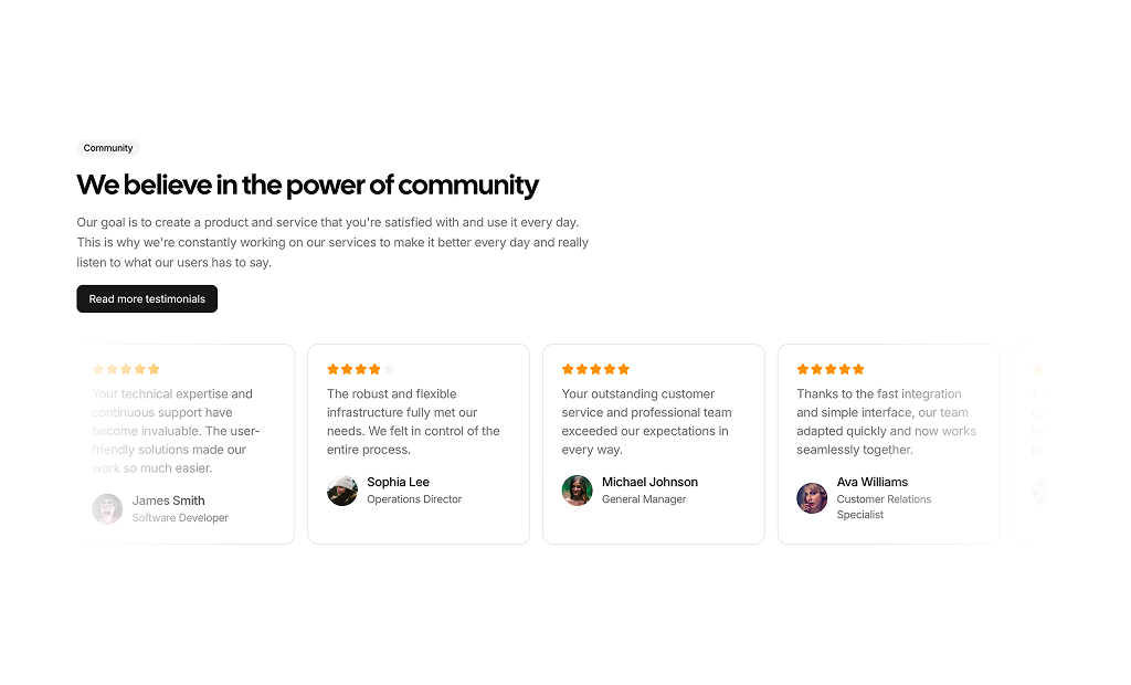
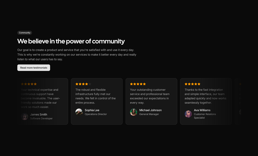
About Testimonials Blocks
Testimonial blocks are shadcn blocks that display customer quotes, names, roles, and optional ratings or avatars. Implemented with React, TypeScript, and shadcn/ui Card and typography components styled with Tailwind CSS, they provide a consistent way to add social proof without designing the layout from scratch. Each block defines structure and hierarchy so you can focus on curating and updating the quotes themselves.
They are used on landing pages, product pages, case study sections, pricing or feature pages, and anywhere trust and credibility matter. You can place a single testimonial block or several in a grid or carousel. They work in Next.js and other React frameworks and integrate with the rest of your shadcn UI—same theming, spacing, and component set—so the page feels cohesive from hero to footer.
All content is editable: quote text, name, role, company, and optional image or rating. Layout and styling are controlled via Tailwind and component structure, so you can adjust grid columns, card style, or typography to match your brand. The blocks support light and dark themes and are easy to extend—for example, adding a “read more” link or connecting to a CMS—while keeping the same shadcn-based foundation.