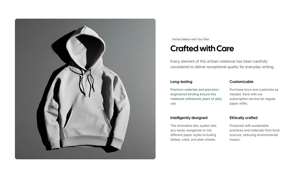
About Product Features Blocks
Product feature blocks are shadcn blocks that highlight a single product’s benefits: icons or images, short headings, and descriptions. Built with React and TypeScript, they use shadcn/ui and Tailwind CSS to present specs or value points in a scannable layout. They answer “what does this product do?” in a consistent, on-brand way.
Use them on product detail pages, landing pages for a specific product, or comparison sections. They fit Next.js and React ecommerce or marketing sites and work alongside product details, testimonials, and CTAs. You can show a few features or many; the block handles spacing and alignment.
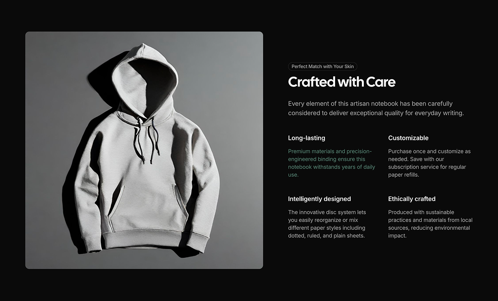
Icons, headings, and body text are editable in code. Tailwind controls columns, gaps, and responsive behavior. You can add or remove items, change layout (e.g. alternating image left/right), or restyle to match your brand while keeping the same shadcn UI foundation.