About Blog Cards Examples
Blog cards are compact content previews that surface your most important articles, tutorials, and changelog updates in a visually consistent way across landing pages and dashboards. In a design system powered by shadcn ui and tailwindcss, blog card components typically bundle the post title, short description, metadata, and call-to-action into a reusable pattern that can be dropped into any grid or list layout. When these cards are implemented as typed react components in a next.js application, teams can standardize how content is presented while still leaving room for custom badges, categories, and author details.
Under the hood, blog cards are often built on top of shadcn blocks such as card, badge, and button primitives, which handle focus states, hover styles, and accessible semantics out of the box. TypeScript interfaces define the shape of the content, slug, title, summary, publish date, and tags, ensuring that every card is rendered with the data it needs and nothing more. Tailwindcss utilities make it trivial to adapt the same card design for dense archive views, hero-level featured posts, or sidebar recommendations by adjusting padding, typography scales, and aspect ratios without duplicating markup.
From an SEO perspective, consistent blog cards improve internal linking, scan-ability, and engagement signals. When used throughout a next.js site, server-rendered blog cards expose clean, predictable HTML around each article link, giving search engines multiple high-quality entry points into your content. Because these components are shared across category pages, homepages, and related-article sections, you can tune the copy and placement once and benefit everywhere. Leaning on shadcn ui components and typed react props keeps the system maintainable as your content library grows, while still aligning with the broader visual language of your application.
Which Blog Card Example Should You Pick?
The four cards cover three common ways to list posts. Choose based on how much space each post gets.
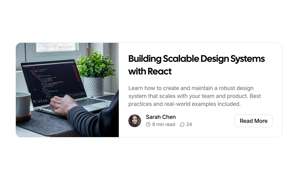
- Horizontal feature: Blog Card 1 puts the cover image next to the title, excerpt, author, reading time, comment count and a Read More button. Use it for a highlighted or latest post.
- Vertical grid card: Blog Card 2 stacks the image, a category badge, reading time, title, excerpt, author and a full width button. It fits blog index grids.
- Compact list row: Blog Card 3 shows the author, title, category and date with a small thumbnail on the right, for sidebars and related post lists.
- Image overlay: Blog Card 4 places the category and title on top of the image with a gradient and a hover zoom, for visual sections such as a homepage.