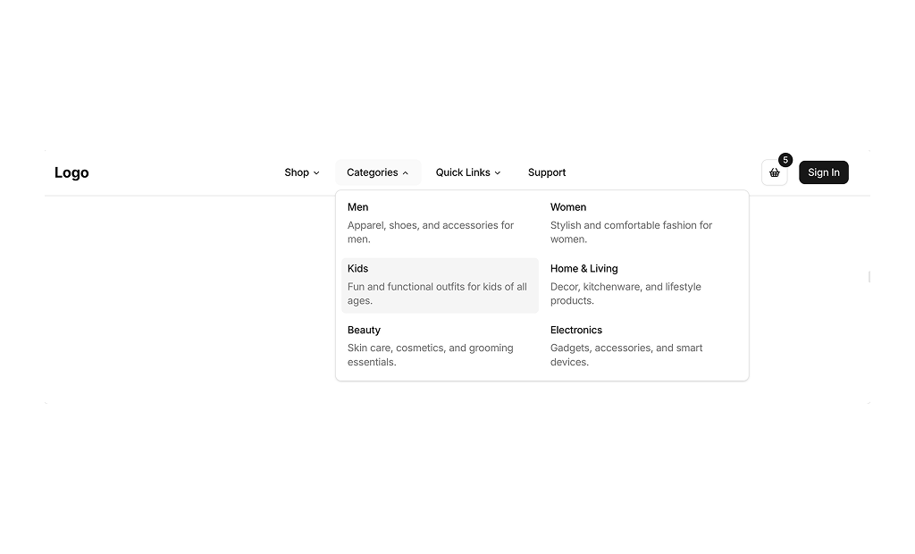
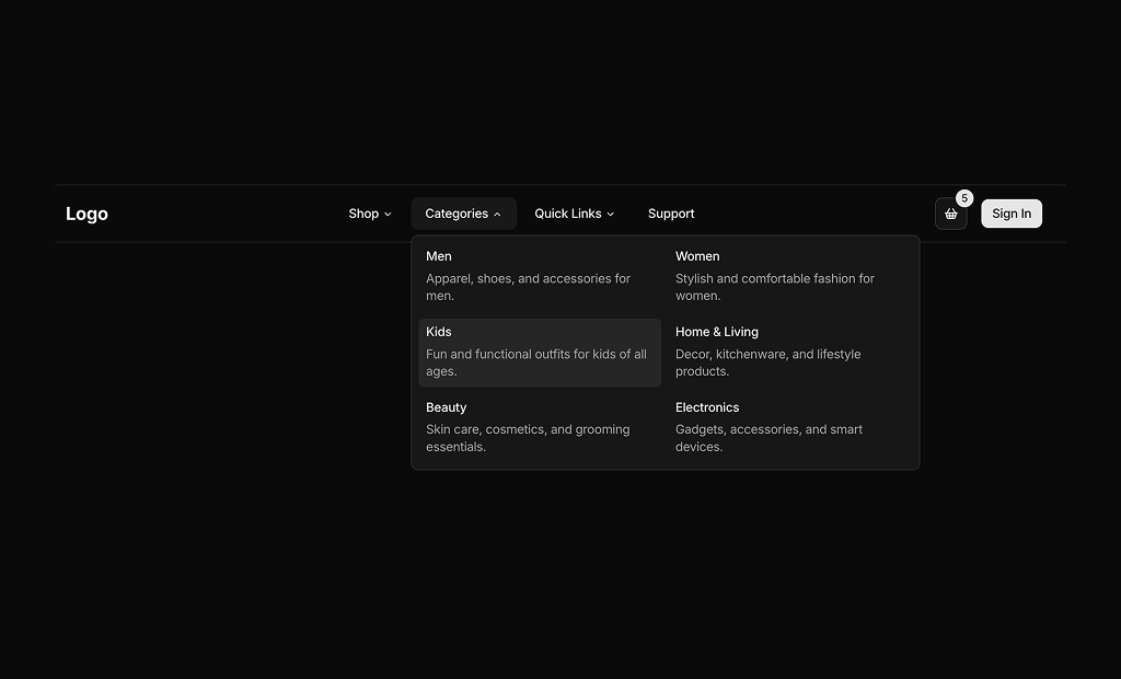
About Navbars Blocks
Navbar blocks are shadcn blocks that provide the top navigation: logo, links, optional search, and mobile menu. Built with React and TypeScript, they use shadcn/ui components (e.g. DropdownMenu, Sheet for mobile) and Tailwind CSS. Each block gives you a responsive header pattern so you can focus on routes and branding instead of layout and breakpoints.
They fit any site or app that needs a global nav—landing pages, dashboards, docs, ecommerce. Use one navbar per layout; links and structure are in your code. They work in Next.js and other React frameworks and support light and dark themes, with patterns like hamburger menus and dropdowns already considered.
Logo, links, and optional search or CTA are fully editable. Tailwind controls spacing, alignment, and responsive behavior. You can add megamenus, change breakpoints, or restyle the mobile drawer while keeping the same shadcn UI foundation and accessible markup.