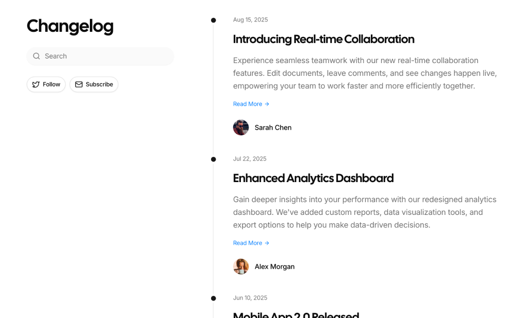
About Changelog Page Blocks
Changelog page blocks are essential components for communicating product evolution to your users. Built with React and TypeScript, these layouts leverage shadcn/ui components to present release notes, bug fixes, and new features in a clean, chronological timeline. They help you maintain transparency and keep your community informed about the latest improvements.
Designed for SaaS platforms, developer tools, and digital products, these blocks offer a structured way to document version history, whether you need a simple list of updates or a detailed release log with categorization tags. The use of Tailwind CSS ensures that the typography and spacing are consistent with your overall design system, while providing the flexibility to adapt the look and feel to your brand.
Each changelog block is fully customizable, allowing you to easily manage content updates directly in your code or fetch them from a CMS. You can modify the layout, add custom badges for different types of changes (like "New", "Fixed", "Improved"), and integrate links to documentation or specific pull requests. By using these pre-built components, you can deploy a professional-looking changelog page in minutes without starting from scratch.