10 Free Community Registries for shadcn/ui
A curated list of free, open source shadcn/ui registries you can install with a single CLI command, from animated components to AI chat blocks.
The shadcn/ui CLI is no longer limited to the official components. With the registry system, any project can publish its own components and you can install them with a single command using a namespace, like npx shadcn add @react-bits/split-text. The official Registry Directory now lists close to 300 community registries, which makes it hard to know where to start.
In this article we picked 10 free registries that are worth adding to your toolbox. We start with our own registry, Shadcn UI Kit, which offers free blocks alongside a premium registry. The other nine are open source, actively maintained and listed in the official directory with a healthy status.
How community registries work
Registries listed in the official directory are built into the CLI, so there is nothing to configure. Run the command below and the component, its dependencies and any related files are added to your project:
npx shadcn add @<registry>/<component>
You can also search a registry from the terminal before installing anything:
npx shadcn search @diceui
npx shadcn view @react-bits/split-text
One thing to keep in mind: community registries are maintained by third party developers. Always review the code that lands in your project, exactly as you would with any dependency.
1. Shadcn UI Kit
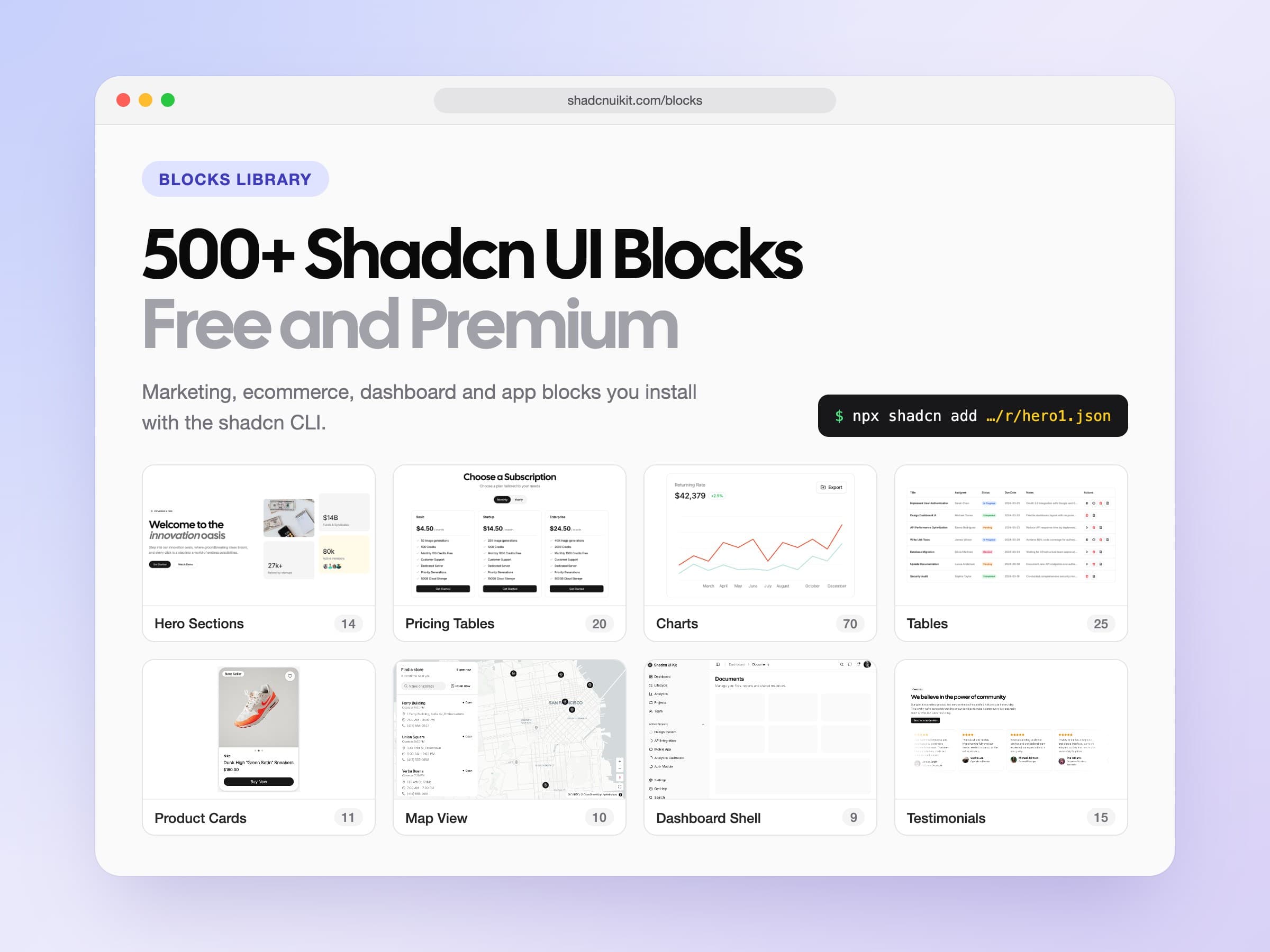
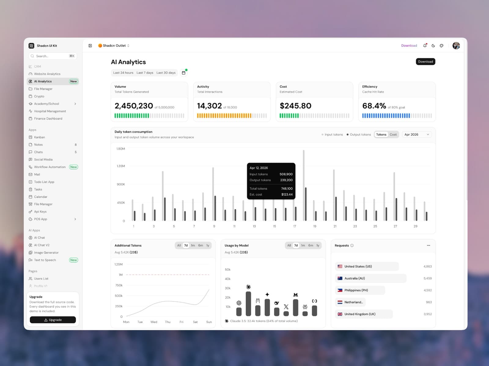
Shadcn UI Kit is our registry, so consider this a friendly disclosure. It offers more than 450 shadcn/ui blocks built with shadcn/ui, Tailwind CSS and React across four groups: Marketing, Ecommerce, Dashboard UI and Application UI, from hero sections and pricing tables to data tables, map views and gantt charts.
A set of blocks is completely free and installs with a single command, no account or key needed. The free set includes a hero section, a how it works section, two newsletter sections, an FAQ section, a sign in form, a stat card, a dialog and seven data tables. Every block page shows its install command:
npx shadcn@latest add https://shadcnuikit.com/r/hero1.json
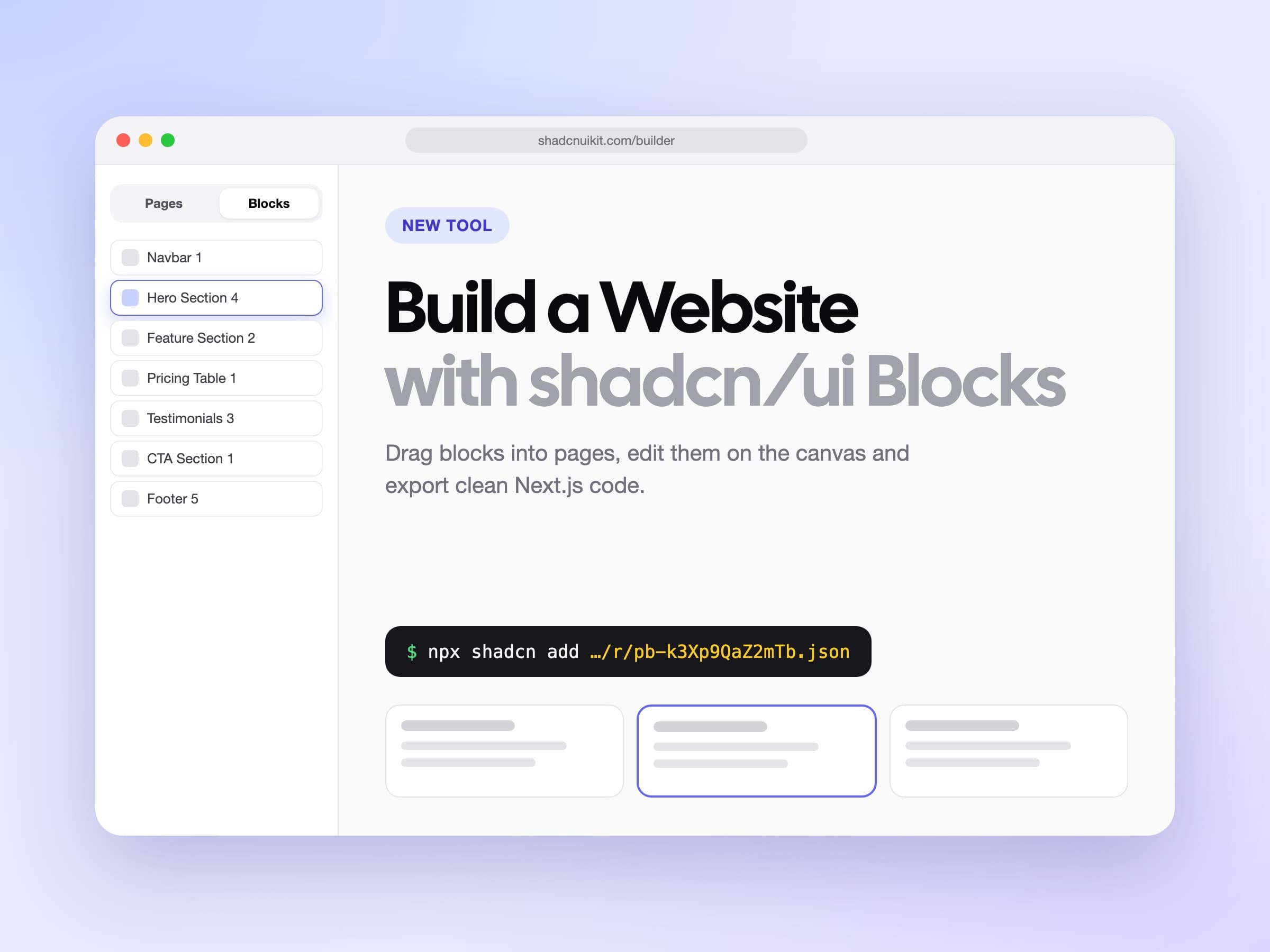
The premium blocks are served from the same registry. With a Pro, Team or Enterprise plan you create an API key in your account under API Keys, then add the registry to your components.json:
{
  "registries": {
    "@shadcnuikit": {
      "url": "https://shadcnuikit.com/r/{name}.json",
      "headers": {
        "Authorization": "Bearer ${REGISTRY_TOKEN}"
      }
    }
  }
}
Put the key in your .env file as REGISTRY_TOKEN and install any block by name with the namespace:
npx shadcn@latest add @shadcnuikit/hero2
Best for: complete page sections and app screens that follow your shadcn/ui theme, with a live preview of every block before you install.
For the full list of free blocks and a tour of every category, see our guide to free and premium shadcn/ui blocks.
2. Eldora UI
Eldora UI is an open source library of animated components built with TypeScript, Tailwind CSS and Framer Motion. The catalog includes device mockups like Safari, MacBook and iPhone frames, an interactive globe, a terminal, marquees, animated grid patterns and a large set of text animations such as blur in, wavy and word pull up.
Best for: landing pages and product showcases that need motion and device mockups without writing animation code from scratch.
npx shadcn add @eldoraui/macbook-pro
3. Aceternity UI
Aceternity UI is known for its bold, showcase style components. Think hover cards with spotlight effects, 3D card tilts, background beams and animated hero sections. The components are free to copy and install, and the paid part of the project is limited to full templates.
Best for: portfolio sites and product pages that want a strong visual first impression.
npx shadcn add @aceternity/3d-card
4. Kokonut UI
Kokonut UI is a collection of polished components built with Tailwind CSS, shadcn/ui and Motion. The catalog covers AI inputs, cards, buttons, pricing sections and small interactive details, all with a clean and modern look that fits well next to the default shadcn style.
Best for: teams that want extra components that still feel like shadcn/ui.
npx shadcn add @kokonutui/ai-input-search
5. Animate UI
Animate UI takes a different approach. Instead of adding new components, it provides animated versions of the primitives you already use: accordion, tabs, dialog, checkbox, tooltip and more. It also includes animated icons and background effects.
Best for: upgrading an existing shadcn/ui project with motion without changing its API.
npx shadcn add @animate-ui/components-radix-accordion
6. Dice UI
Dice UI focuses on accessible, composable components for real applications. It fills the gaps in the default shadcn/ui set with pieces like sortable lists, Kanban boards, tags input, masonry layouts, file upload, color picker, stepper, timeline, phone input, rating and a media player. Every component is keyboard accessible and copy paste ready.
Best for: dashboards and internal tools that need form and data components beyond the basics.
npx shadcn add @diceui/sortable
7. AI Elements
AI Elements is maintained by the Vercel AI SDK team. It provides the building blocks of an AI chat interface: conversations, messages, prompt inputs, reasoning blocks, tool calls, sources and code blocks. Everything is designed to work with the AI SDK out of the box.
Best for: chat and assistant interfaces built with the Vercel AI SDK.
npx shadcn add @ai-elements/conversation
8. Motion Primitives
Motion Primitives is a set of beautifully designed motion components that are easy to copy and customize. Text effects, animated numbers, in view reveals, cursors, morphing dialogs and sliding panels are all included.
Best for: subtle, tasteful motion in product interfaces.
npx shadcn add @motion-primitives/text-effect
9. React Bits
React Bits is a large collection of animated and interactive React components, from text animations to backgrounds and cursor effects. Most components are available in both Tailwind and plain CSS variants, and the registry has one of the highest health scores in the directory.
Best for: creative websites that need memorable animations and backgrounds.
npx shadcn add @react-bits/split-text
10. Bundui
Bundui is another registry from our team. It contains more than 150 handcrafted components built with Tailwind CSS and shadcn/ui, covering marketing sections, e-commerce, dashboards, real estate, finance and more. Every component is free to install and works with the same CLI command.
Best for: full sections and industry specific blocks you can drop into a page.
npx shadcn add @bundui/hero-sections-01
Honorable mentions
A few more registries that did not make the top 10 but are still worth a look:
- Cult UI for a small, carefully designed set of animated components like dynamic islands and expandable cards.
- blocks.so for clean application building blocks.
- Intent UI for an accessible component library you copy and own.
- Skiper UI for uncommon, creative components for Next.js projects.
- 8bitcn if you want a retro 8-bit look for a side project.
Tips for using multiple registries
- Check the health status. The official directory shows a health score for every registry, based on reliability, correctness and installability. Prefer registries marked as healthy.
- Keep your theme in one place. Most community components use the same CSS variables as shadcn/ui, so define your colors once in
globals.cssand everything follows. The Theme Generator helps you build that palette. - Read the installed files. Registry items can include dependencies, hooks and utility files. Review them before committing.
- Pin what you rely on. Once a component is in your project you own the code, so update it on your own schedule instead of reinstalling blindly.
The registry system turned shadcn/ui into an ecosystem. With the ten registries above you can cover motion, AI interfaces, complex data components and full marketing sections without leaving the CLI.
If you need complete page sections and app screens rather than single components, the Shadcn UI Kit blocks can be installed with the same shadcn CLI. They cover marketing, ecommerce, dashboard UI and application UI blocks such as map views and gantt charts.