About Shadcn Signin Forms Blocks
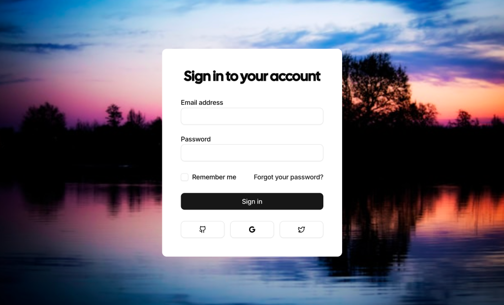
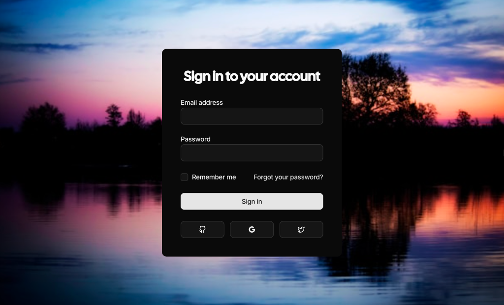
A sign-in form is the entry point where returning users prove who they are before they reach their dashboard. These three shadcn sign-in blocks give you finished login screens: a minimal centered form, a split layout with a cover image and a card floating over a photo.
Like our other shadcn blocks, each screen is written in React and TypeScript and styled with Tailwind CSS on top of shadcn ui components such as Label, Input, Checkbox, Button, Separator and Card. The fields already carry the right autocomplete attributes, and the layouts follow your light and dark theme, so you can focus on wiring the form to your auth provider.
Key Elements of a Sign-In Form
- Clear heading: a line such as “Sign in to your account” that confirms users are on the right screen.
- Labelled credentials: email and password inputs with visible labels and autocomplete hints for password managers.
- Session option: a remember me checkbox for people on their own devices.
- Recovery path: a forgot password link right next to the fields.
- Alternative sign-in: provider buttons separated from the main form by an “or continue with” divider.
Where and Why to Use Sign-In Form Blocks
Authentication screens look simple but take time to get right: spacing, label association, autocomplete tokens and provider buttons all need attention. Starting from a finished block lets you ship a consistent login page in minutes and keep it in line with the rest of your shadcn components.
- SaaS dashboards: the login route that sits in front of your admin panel or app shell.
- Internal tools: a plain centered form for staff portals where branding matters less.
- Customer portals: a branded split screen for billing or support areas.
- Developer products: GitHub and GitLab buttons for users who prefer to sign in with their code host.
- Campaign or event apps: a card over a photo when the login page doubles as a landing screen.
Sign-In Form Blocks in This Collection
- Sign In Form 1: The lightest starting point, free to install. Pick it when the login page should stay out of the way and social sign-in is secondary.
- Sign In Form 2: Suits products that want a branded first impression on desktop while keeping phones focused on the form. Its labelled provider buttons work well when social sign-in is the main path.
- Sign In Form 3: Use it when the whole screen should carry an image or mood, for example a seasonal campaign or a hospitality app.
Similar Block Categories
- Form Layouts: build the sign-up, profile and settings forms that follow the login.
- Onboarding Screens: greet first time users with a short setup flow after they sign in.
- Dashboard Shell: the app frame users land in once authentication succeeds.
- Modal Dialogs: ask for a password again inside the app without leaving the page.
Accessibility
All three forms tie each Label to its input through htmlFor and id, mark both fields as required and use autoComplete=“email” and autoComplete=“current-password”, which helps password managers and assistive technology. The remember me checkbox has its own label, and the shadcn Button and Input components keep visible focus rings for keyboard users.
The icon only provider buttons in Sign In Form 1 include screen reader text for GitHub, Google and Twitter. The same buttons in Sign In Form 3 have no text alternative yet, so consider adding an aria-label or a sr-only span to each of them. When you connect the form to a backend, announce failed logins in a live region next to the fields.
Sign-In Forms FAQ
npx shadcn@latest add @shadcnuikit/signin-form1. Sign In Form 2 and Sign In Form 3 are part of All Access.action="#" and inputs named email and password, and the submit button has type=“submit”. Point the action to a server action or API route, or add an onSubmit handler that calls your auth library. Replace the href of the Forgot your password link with your reset page.