About Chat Bubbles Examples
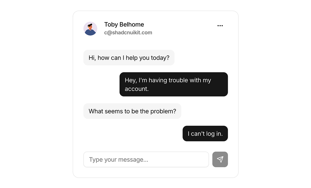
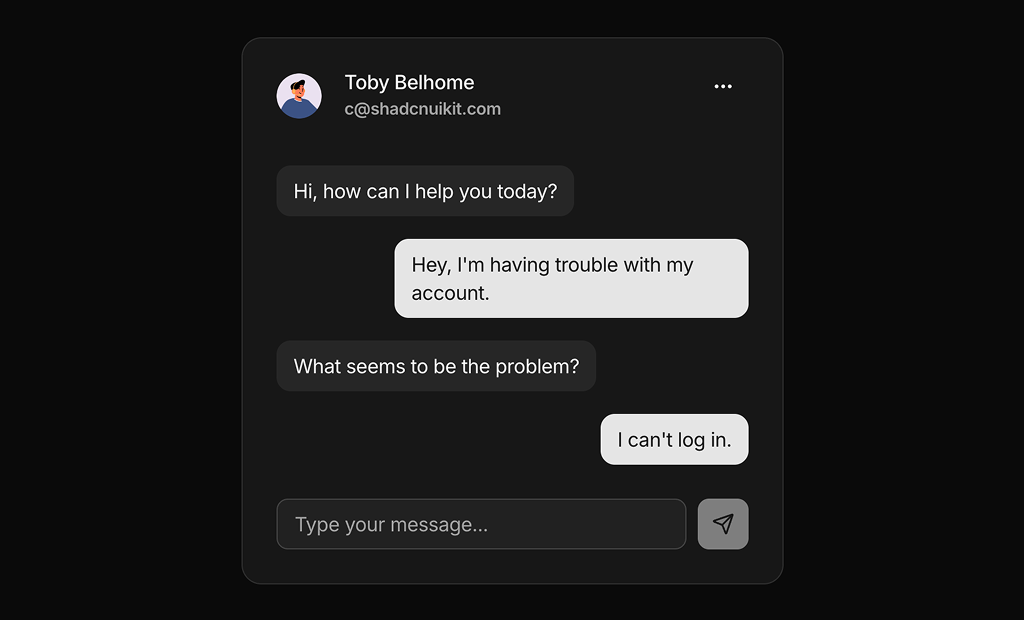
Chat bubbles are conversational UI components that turn raw messages into a structured, readable dialogue, making support widgets, messaging apps, and collaboration tools feel more human and approachable. In a design system built with shadcn ui and tailwindcss, chat bubble layouts control alignment, spacing, and color roles for senders and receivers while staying visually consistent with your other shadcn blocks. When these bubbles are implemented as reusable react components in a next.js codebase, teams can drop the same patterns into marketing demos, product screenshots, and live chat experiences without duplicating markup.
Under the hood, ChatBubbles are small, focused components with typescript props for variant, avatar, timestamp, and message content, which keeps the API predictable as you introduce new message types such as system notices or rich content. They typically wrap lower-level shadcn ui primitives for layout, text, and avatar, so accessibility details like focus handling and color contrast are handled consistently. Tailwindcss utilities can then be applied to control stacking, responsive behavior, and subtle motion, giving you fine-grain control over how conversations feel without rewriting core logic.
From a broader architecture perspective, ChatBubbles fit naturally into next.js client components that subscribe to real-time data, while the surrounding documentation or marketing examples benefit from server rendering for SEO. By standardizing this pattern as a shared set of react components powered by typescript, shadcn ui, and tailwindcss, you create a foundation for both production chat interfaces and high quality visual examples that can be reused across the site.