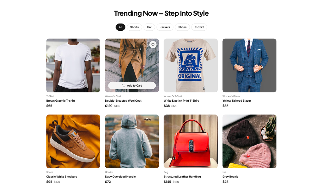
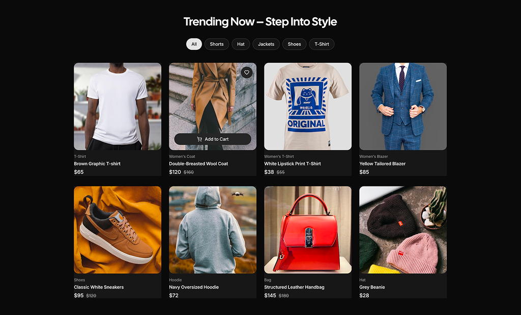
About Product List Blocks
Product list blocks are shadcn blocks that display multiple products in a list or grid: image, title, price, short description, and action buttons. Built with React and TypeScript, they use shadcn/ui Card and Button components styled with Tailwind CSS. Each block gives you a consistent ecommerce listing layout so you can plug in your data and styling without rebuilding the structure.
They are for category pages, search results, and any storefront view where users compare products. Use them in Next.js ecommerce routes or React storefronts; they support responsive grids and work with the shadcn registry and CLI. You can show 4, 8, or more items per row and pair them with filters or breadcrumbs.
Product data, images, and labels live in your code or CMS. Tailwind controls columns, card style, and spacing. You can add wishlist icons, quick-view triggers, or badges; the underlying shadcn UI and TypeScript structure stay the same so you keep full control and theme support.